
")

Are you trying to arrange insights of your data in a manner that everyone in the organization is able to understand the implications of the same and take actions accordingly? Well Power BI is a tool by Microsoft 365 solutions designed to get the best insights into data and help you make informed decisions. The tool is a managed cloud service provider that helps you visualize your data and share the insights with the people in the organization. But why does one need data visualization, and how can it help your business?
In this blog, we’ll talk about data visualization, the importance of data visualization, and how Microsoft BI can help you visualize data in a more effective manner.
What is Data Visualization?
Data Visualization is a graphical representation of raw data in the form of charts, graphs, diagrams, maps, etc. It helps to process the data in a way that you can clearly see and understand the trends, outliers, and patterns in data.
The demand for data visualization has increased with the rise of Big Data and growing business ideas. And today, for businesses of all scales to stay competitive, it is important to incorporate data visualization methods.
Importance of Data Visualization
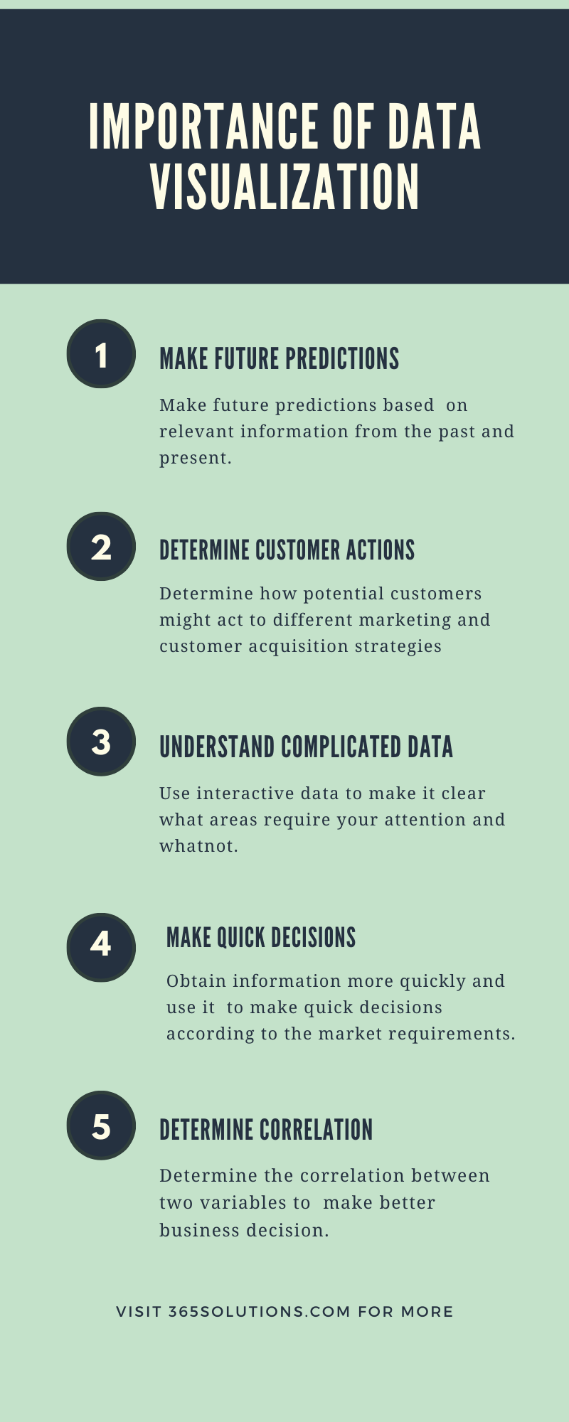
Now that it is clear that what is data visualization, you might be intrigued to know how is it relevant or important to your business? Let’s understand the importance of data visualization with the help of cloud-based solution provider in the below-listed points:
1.Make future predictions
It might seem to be the most obvious use of data visualization; however, it the most pertinent application to make key decisions with the business. It is difficult to make future predictions without having relevant information from the past and present. Hence, managed cloud service provider helps businesses to predict where they are and where they can go. One can clearly understand the opportunities available within the market based on the graphical representation of the data.
2.Understand customer actions
It helps businesses to understand the frequency or how often customers purchase. This gives them clear insights into how potential customers might act to different marketing and customer acquisition strategies.
3.Understand complicated data
It is difficult to arrive at a conclusion when the data is available in a haphazard manner. Interpreting data from spreadsheets and numbers can be a time-consuming and challenging task. Thus, when you have interactive data, it makes clear what areas require your attention and whatnot.
4.Make quick decisions
The ability to obtain information more quickly and representation of data in a uniform manner helps businesses to make quick decisions according to the market requirements.
5.Determine Correlation
Determining the correlation between two variables is an important characteristic of data visualization, which helps in making better business decisions. It would be extremely difficult to determine the relationship between two variables without the existence of data visualization.
Best ways to visualize your data
We have stated above how Power BI is an important tool as a managed cloud service provider for data visualization. However, there are plenty of ways to visualize your data with Power BI. Below listed are the best ways to visualize your data:
1.Line Chart
The line chart is important to display data across a period of time to view trends and intervals. The data points are connected with the straight line, with each point in the line equivalent to the data value.
2.Bar Chart

A bar chart is the most preferred method to visualize data and compare groups or categories while displaying data that includes negative values.
3.Pie Chart

A pie chart is a popular choice when you are looking to illustrate the contribution of each factor to the total value. It is widely used by industries that have various product segments or cater to customers in different markets.
4.Scatter Chart

The data visualization chart helps you compare two different variables. It is used by companies to understand the correlation between two variables and how they are interdependent on each other.
5.Waterfall Chart
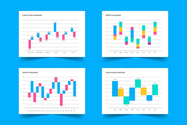
A waterfall chart, or bridge chart, is used majorly when companies want to understand the positive and negative impact of the change on the initial value.
Conclusion
There are more Microsoft BI visualization tools; you can find the list on the microsoft365solutions website. However, we have mentioned the most prominent ones, which are used extensively by organizations across the world. Hope this article gives you a clear understanding of data visualization and how it is important for your business. What other tools are you using to visualize data in your business? Let us know in the comments below.